Radom got beautiful


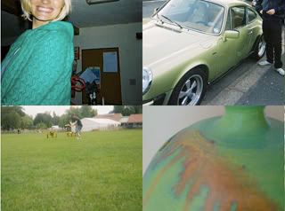
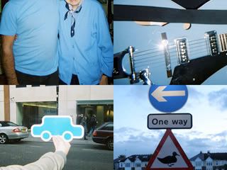
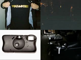
Nice collection of photographs ordered by colour, we are great fans of mass imagry, and this pushes our buttons..
check out the site www.randomgotbeautiful.com
Nikki Farquharson(Graphic Design & Illustration) is the creator of this site, she also has a real nice personal site
www.kinkinerd.com


3 comments:
This site seems quite dry at the moment, maybe it will get better. These are the same concept as lomo walls made up of photos of certain colours which has been done before.
The 3 column grid seems to big as I see only see 9 images from a gallery at one time on my monitor.
As a result I seem to be picking out the certain individual images that, in terms of general composition, are individually quite weak.
Nine random images placed unconsidered into the 3 column grid that they are using at the moment has not "got beautiful" yet for me.
Maybe in a grid with smaller images it could give more room for an overall composition to develop.
One thought I had when looking at it was to make the image sizes smaller, the overall size of the grid huge, and allow the person viewing to scroll up down left and right. Allowing them to frame images themselves. They need more images to do this though.
I guess its the randomness of the images and the way that they are displayed in a grid which will determine if it will work or not.
I don’t think its quite working at the moment. Thoughts anyone?
do you have any links to good lomo sites.. I do love lots of images... You make some good points.. I like the idea of smaller images in a larger grid, maybe a rollover enlarges the images slighly and a click opens them in a new window? you got a site up yet.. or a flickr or something?
I think that I ranted a bit too much there. I confess I have a horrible love hate relationship with lomos and mass imagery. So don’t get me wrong I see a lot of potential in it.
I just feel that this lomo wall idea has been doing the same thing for a while now. I feel that a lot of lomo walls all seem to be a bit too stereotypical now maybe?
What do you think?
One wall that I thought was interesting was intended as some kind of living portrait of the surrounding community. It featured 4,000 photographs documenting the Waterloo area and allowed further exploration through touching screens to hear the contributors talk about the area. I felt it was refreshing to see a lomo wall given more depth than only looking cool like a lot of them.
http://www.flickr.com/photos/pebaline/291619073
I haven’t got a site up yet, I’m working on it. Yesterday I handed in 8 films to be developed for Monday. So I hope that some new photos will give me an incentive to do it. It's something I really should get on with, I'll let you know when I do
Post a Comment